The story behind our 'nooh' branding
Introducing nooh Studio
Today is the day! We’ve been working on this for months… Our founder Helena Traill has been a freelance graphic and web designer for over 6 years now. She launched the self-named brand Helena Traill Design Ltd in June 2021, where the dream was always to collaborate with other designers and build a business.
However, we didn’t know that it would happen so fast… 1 year in as a limited company and we’re now a core team of 3 based in West London. nooh Studio has always been on the back burner, but here we are - launching it today!
From the outside we may look very different (from a freelancers’ design business, to a full blown creative agency), but there is one thing that will always stay the same: our vision to be pioneers in healthcare design - just like our clients, we want to facilitate positive change.
This blog post takes you through all the decisions that went into our ‘nooh’ brand, from the name choice, logo, colours, fonts, graphic identity and refined services.
Our name
Like our designs, the name nooh has a unique backstory… Everything at nooh has a meaning and story, which is what we will address in this blog.
A place where you feel at peace is imperative for creative freedom - this is why ‘nooh’ comes from the name of our founder Helena’s childhood comfort blanket. We love the sentimental. We love being a design agency that will hold your hand through the processes, and we want to be a place that our clients return to time and time again. Overall, we listen to understand your vision, making sure everyone involved has the courage to be honest.
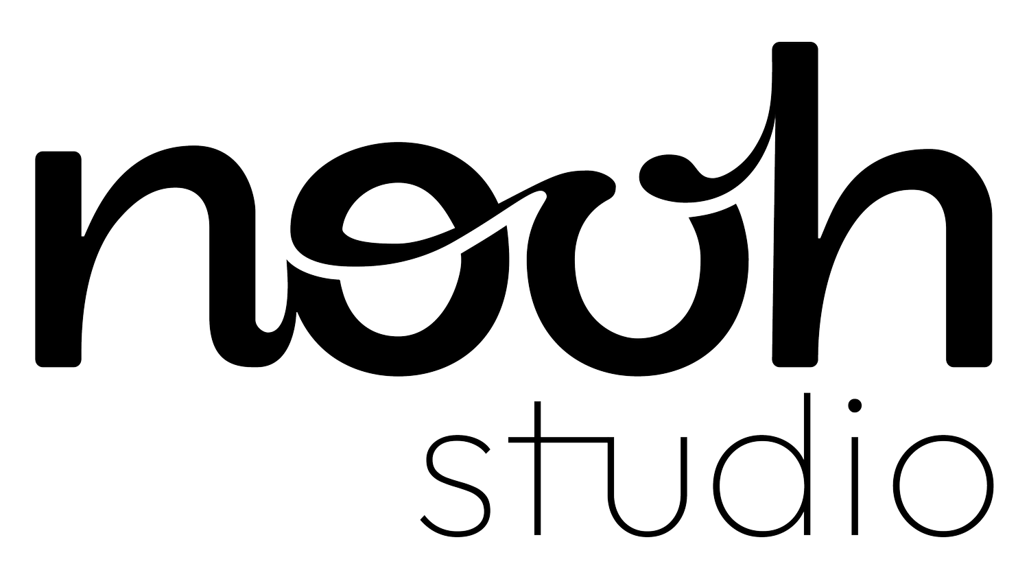
Our logo
Helena’s logos have always incorporated the hand-drawn, in each iteration over the years - we still wanted to maintain the sentimental, down-to-earth and personal look that hand-writing conveys. Through hand-drawn, connected letters, we wanted to add a layer of meaning: connecting people and communities through great design.
Our colours
Settling on a colour palette was always going to provide back and forth, but we’ve settled on muted hues of blues and greens, with black and white as our highlight colours. The meaning for these choices ties in very well with our values.
We chose green because it’s associated with new life; regeneration, growth, discovery and renewal - symbolic of brand refresh and new brands. Psychologically, it is highly connected to nature, innovation, health and wealth. It also looks great with every other colour!
On the other hand, blue is the most trusted colour; serene, reliable, orderly, trustworthy, dependable. We wanted to project an image of integrity, depth of understanding, wisdom, communication, efficiency, strength and dedication.
Our fonts
We have changed our fonts to Interstate Compressed and Outfit. Interstate Compressed is a bold, striking font that oozes energy - we wanted it to be visually outstanding to represent how we make sure we develop brand identities that stand out from the crowd.
Conscious about accessibility, we chose Outfit - a solid, geometric sans serif font that is both easily legible and looks great. Functional, aesthetic and accessible is how we want our clients’ brands to be!
Our squares
The recurring three-layer graphic represents the three core pillars of nooh studio:
Learning through creativity
Storytelling
Community
Given our 3-pronged process of Insight, Ideas and Innovation, we wanted the squares within our logo to represent thinking inside and outside the box, as well as imagery showing the many layers that compound great design.
Helena’s childhood comfort blanket, noo-noo, provided her a safe space to feel inspired and creative. A classic shape, it can be interpreted as a blank canvas… a post-it note… a comfort blanket… each one a checkpoint for developing a successful brand design.
Our Services
We are changing up the way we offer our design services.
We’re now providing 4 core services and, for ongoing clients, we work on brand application by creating and enhancing your digital footprint.
Branding: Our full-spectrum branding process is all about providing an outstanding service - creating a brand that your users, and your company, will be passionate about. We cover the essential elements: brand personality, brand experience and visual identity.
Brand Refresh: Refreshing your businesses' brand identity doesn’t have to be daunting - we offer a safe space to be creative, inspiring a truly bespoke experience through expert consultancy and an in-depth understanding of your brand in order to maintain its essence, but update its look and feel.
Brand strategy: We work with you to identify a brand strategy that feels right for your business and aligns with your values, whilst ensuring you’re favourable to customers.
Design Sprints: These are collaborative design sessions where we ideate and solve user pain-points, as well as embracing our creative thinking process. Through understanding the brief, asking the right questions, prototyping and testing these ideas, we can decide on the best direction to take the next steps.
For ongoing clients, we work holistically on many aspects of your brand identity - your Digital Footprint. This includes: Animation, Copywriting, SEO, Newsletters, Blogs, Social Media, Templates, Infographics, Pitch Decks, Treatments.
We hope you like this more sophisticated look - we’re really looking forward to collaborating with many more awesome impact-driven brands, to expand our own community. Do get in touch or come and stop by at Second Home, Holland Park for a coffee!